Check out Domaine's fab post on panoramic murals and including our very own Louvre #1 mural in their feature story!
Murals
Why Something Small Can Make A Big Difference /
Interior by Raji RM & Associates; Photography by Rikki Snyder
I know I often talk about "grand" gestures and yes, in some ways murals have become a signature style in many of my projects. But, if you look closely at the whole room and observe or better yet, if you actually walk into a room I've designed you will notice that while the big gestures draw you in at first, it is several of the small gestures that put a smile on your face and makes you actually want to linger. Designing a room is not about just one grand gesture. I know that because I still design many homes with nary a mural in it. It is the sum of several parts that is much greater as a whole. Sometimes when it does involve a grand gesture like a mural then I think carefully about what it might do to a room's composition, the architecture and how each piece, each move I make interacts with and affects the other parts of the room and in fact the rest of the home. Every piece in the room plays a role, like characters in a play, and make the room come together and come alive. Nothing is trivial. Everything bears consideration.
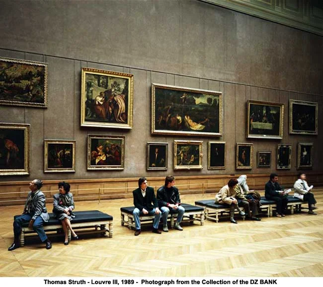
And when I say smaller parts I mean all the way to the tiniest detail. A good example is my own living room. I devoted nearly an entire wall to Leopold #2 mural seen above. I chose this mural, because the original painting reminds me of Thomas Struth' photographs. I like to think that perhaps Struth was inspired by it to create his Museum series. Besides, every time when I have guests in my living room looking at this mural it is down right exhilarating and funny at the same time. It is as if they and the room together have now become part of a painting/photograph too animating the whole space. It is also a happy nod to my love of art, museums and people watching!
Typically, when guests come into this room, they are taken by this enormous mural for the first few minutes and slowly as they settle down on one of the lounge chairs or sofas they get comfortable and start chatting. I think it is during that time they start noticing all the other pieces and finally some one (often it is a child who does) notices that little, tiny wire sculpture sitting atop the shelf on the wall adjacent to the mural. Some ask what it is and how come I placed such a tiny sculpture next to this large mural and I say it's just a play of scale and a reminder of how tiny we all are in this great, big world. And they smile and the conversation turns to more worldly matters, our children, family, DC politics and I feel like all these little things in the room are all partaking in this lively conversation and are pleasantly happy to be there too.
Raji RM & Associates | Interior Designer & Decorator
Washington DC | New York
Contact us to learn more about our work
Inspired Monday Morning: Thomas Struth /
You have probably guessed it by now - I have a thing for grand gestures. In fact, grand spaces as cavernous as they are and sometimes impractical and unnecessary, do create a very strong emotion in me. I think it's one of the reasons I absolutely love the great, big museums around the world. I've also learned that grand gestures in design are best appreciated when they go hand in hand with subtle and small gestures. In my work, very few realize the small design juxtapositions that create a rather large and meaningful impact in a very personal way. Never mind they don't always get noticed. They do the job quietly and beautifully. The large gestures certainly do get all the attention - like my murals. But, if I don't exercise the control to select the right space, the right subject, the right scale and colors and most importantly the very meaningful and small gestures that go with the larger ones - mind you they will cease to have the impact they usually do. And almost always it's the smaller, unnoticed gestures that clinch these larger than life designs making the room tell a story.
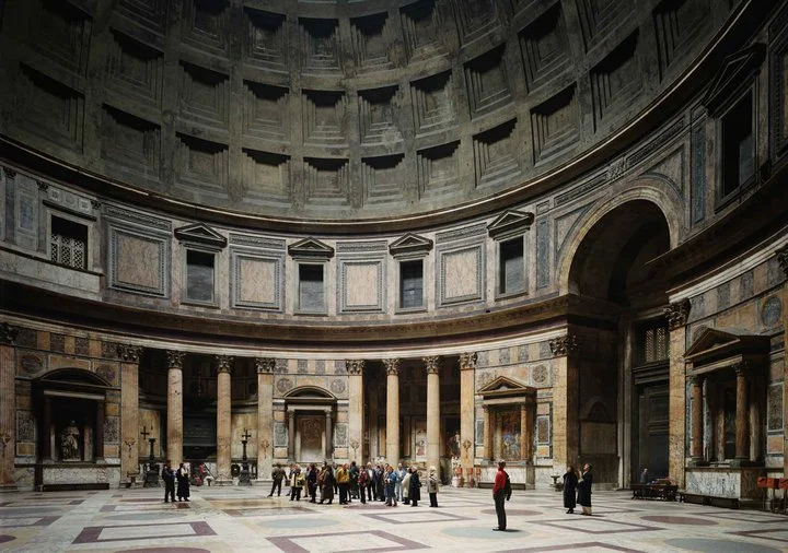
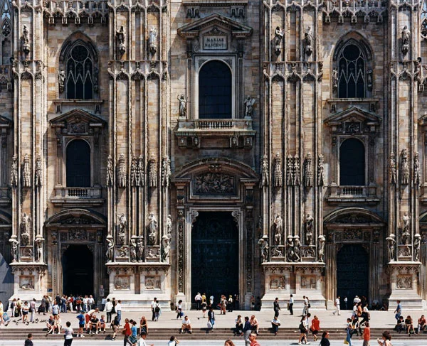
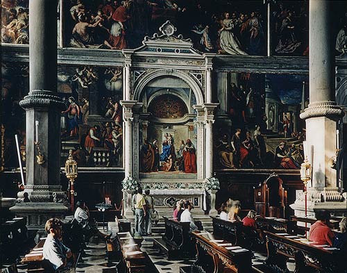
I can honestly say, I learned these inertia-ted subtleties of design by observing artists I adore. Particularly one - Thomas Struth. His Museum series of photographs enthrall me till date. Each a great story, each an exercise in grandeur and subtlety, the perfect complement of the big and the small. Of pride and humility. Of monumental scale and human proportions. Most importantly of dreams and reality and how they are so necessary to wisk one away to large fantasies only to come right back to the reality of how very small we really are in the grand scheme of things. And you guessed it...il est tout ma tasse de thé!
All Thomas Struth' photos via Tumblr & The New Yorker;
Leopold's #2 Mural from Raji RM murals collection. Juxtaposed on the adjacent wall is a tiny French wire sculpture propped on a shelf. Think David and Goliath! - Interior Design by Raji RM & Associates;
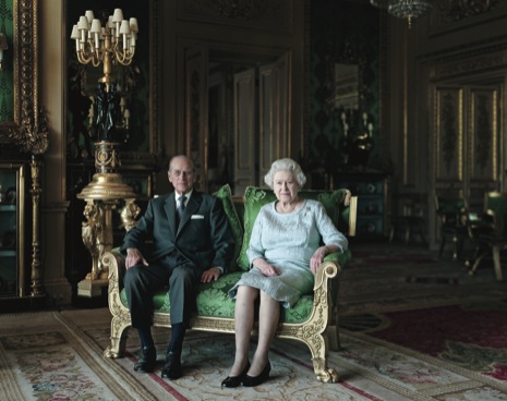
A most excellent article on this portrait by Thomas Struth and his work in The New Yorker
Raji RM & Associates | Interior Designer & Decorator
Washington DC | New York
Contact us to learn more about our work


