Artist

Inspired Monday Morning: Guy de Rougemont by Raji Radhakrishnan

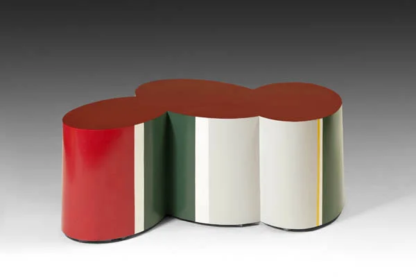
Great vintage originals have always been in vogue and are very often replicated. However, it's one thing to find vintage furnishings that look so right for today but an altogether different experience to find those that look like a perfectly made contemporary design but are in fact vintage. It is pure bliss and exactly how I feel about the French artist, Guy de Rougemont (born 1935). A prolific painter, sculptor who also designs furniture till date and tapped by the influential French designer Henri Samuel back in the 1970s. Guy de Rougemont's iconic Cloud Table designed in the 70s and in different variations is shockingly au courant and hard to believe he designed it nearly four decades ago! His Table Nouage Rouge (Red Cloud Table) from 1970 seen above is a good example.

One look at his work on canvas, murals, totems and sculptures can tell you how he uses abstract art to interpret his view of the world in a rather baroque and colorful way. It is said that Guy de Rougemont has thought of cities as jungles and has tried to create, through his interventions, ways to penetrate and resonate with his surroundings. Not limiting his art (or his thinking) to canvases, his work extends to sculpture, furniture, objects, rugs, stained-glass windows (of course!), porcelain, ceramics, stamps, posters and more recently wine labels. And the fact that he continues to create art and objects that are not only very much his style but always relevant and avant garde at the same time is not an easy feat. Neither is being always one step (or several steps) ahead of his time. I for one find that the causal and casual effect of having a piece of art made functional and amidst other "regular" furnishings, a delightful and unique experience and one that I would love to see adopted in more interiors!

- xo, Raji

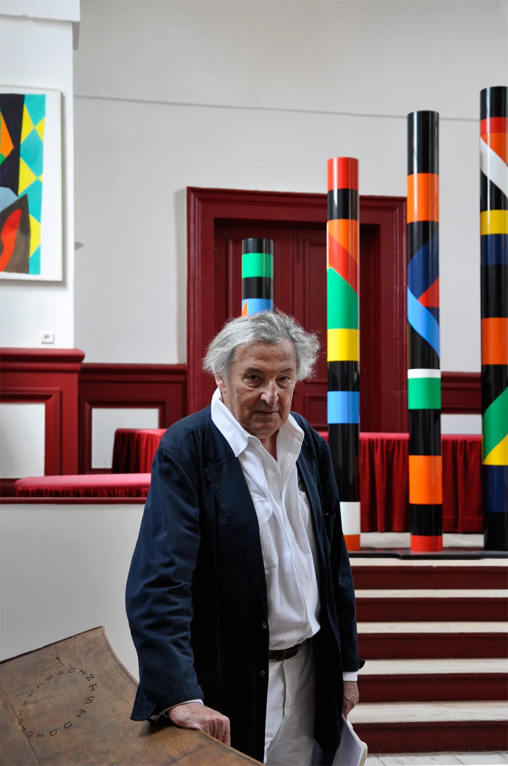
Guy de Rougemont, 2011

Guy de Rougemont, 2011

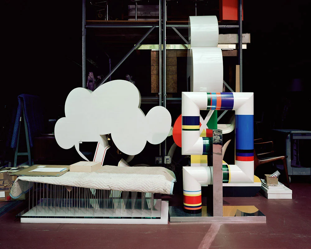
Folding Screen by Guy de Rougemont

Folding Screen by Guy de Rougemont

Cloud Table by Guy de Rougemont

Cloud Table by Guy de Rougemont

Guy de Rougemont 1992; Photography by Michel Baret

Guy de Rougemont 1992; Photography by Michel Baret

Inspired Monday Morning: Antoni Tapies by Raji Radhakrishnan

“The dramatic sufferings of adults and all the cruel fantasies of those of my own age, who seemed abandoned to their own impulses in the midst of so many catastrophes, appeared to inscribe themselves on the walls around me.." - Antoni Tapies

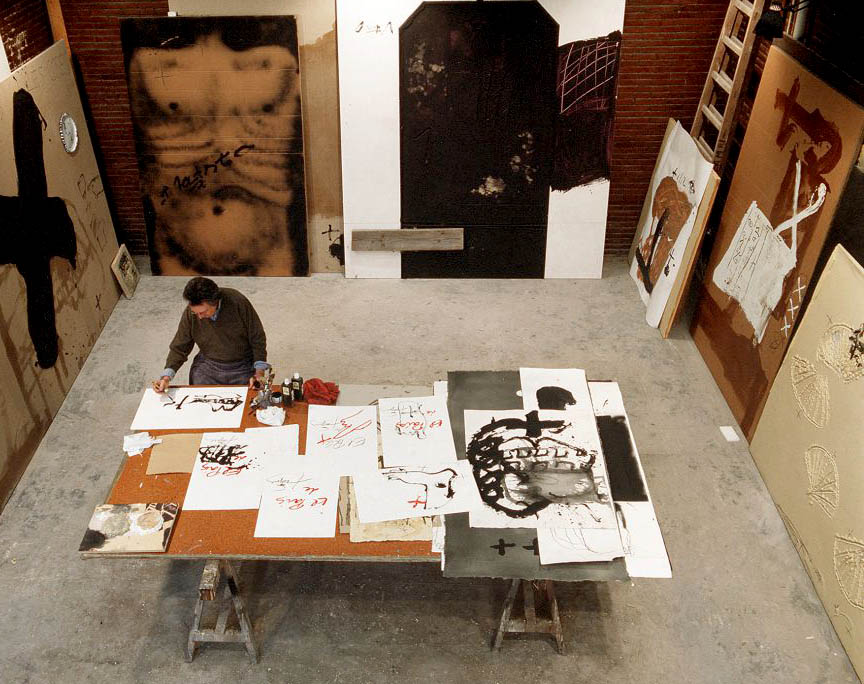
His works remind me of Cy Twombly. But it seems he was once influenced by Joan Miró and Paul Klee. Then he abandoned these influences to what became his signature style of work - "the heavily built-up surfaces that were often scratched, pitted and gouged and incised with letters, numbers and signs" - William Grimes, New York Times. The critic John Russell said it best and referred to his works that “seemed to have been not so much painted as excavated from an idiosyncratic compound of mud, sand, earth, dried blood and powdered minerals.”

Far from morbid and suffering thoughts (especially for a Monday morning) and as much as a happy person that I am, there is something about Tapies' work that draws me, captivates me and makes me want to discover more of him and his work. What can I say, other than, il est tout ma tasse de thé!

Antoni Tapies, 1923-2012

Antoni Tapies, 1923-2012

Eduardo Chillida by Raji Radhakrishnan

Eduardo Chillida

Eduardo Chillida

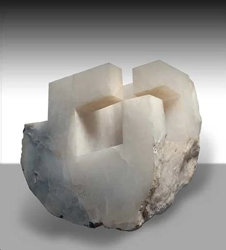
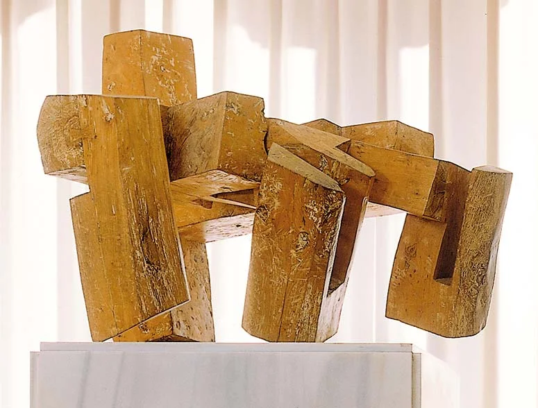
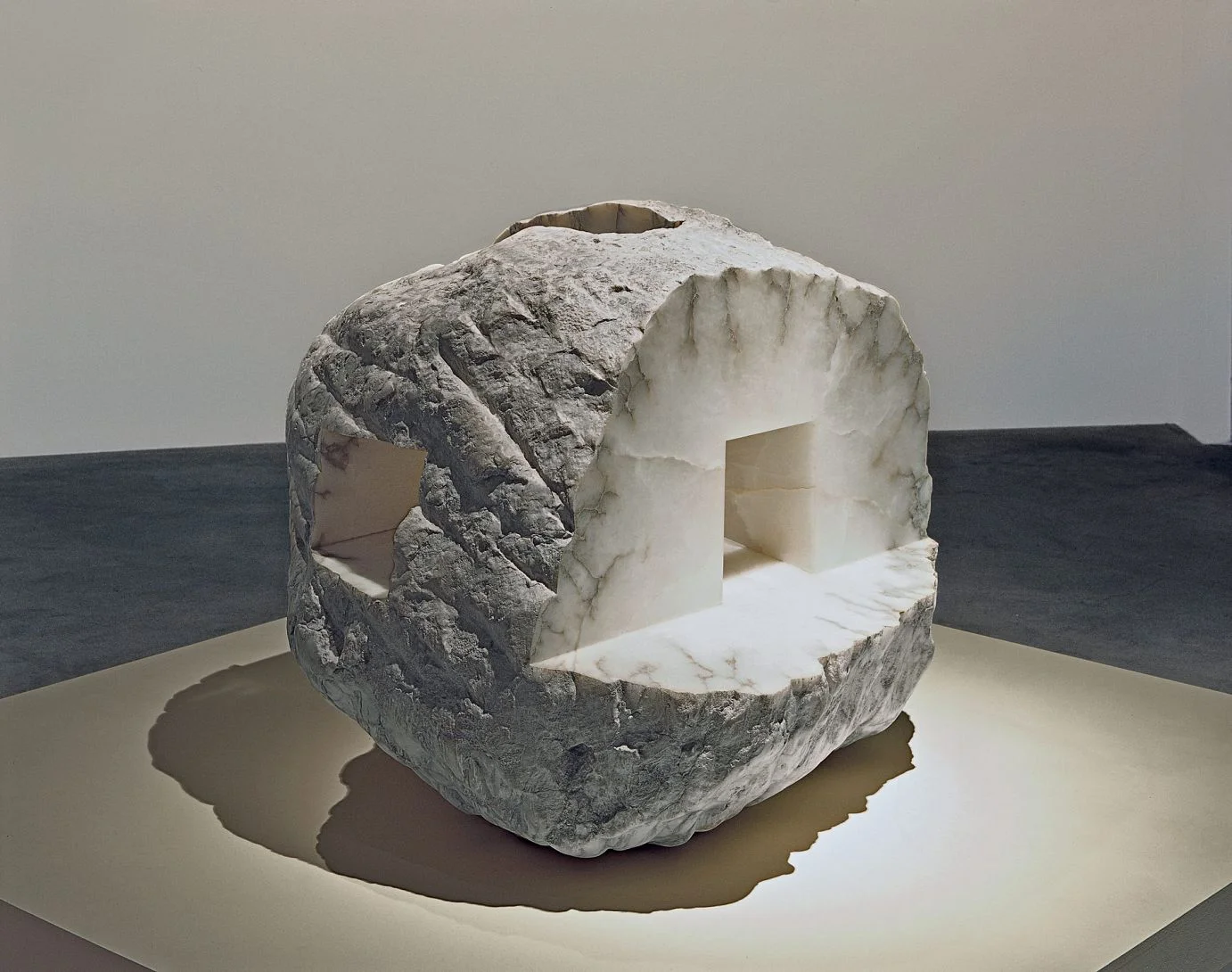
What do you think of when you see a work of art? Or how do you react? When I walk through a museum or gallery my emotions tend to run the whole gamut. Everything from no reaction to "whoa" to complete entrancement. Of all these emotional reactions, I don't recall stepping back and thinking "strength" or "strong and masculine" as I have when seeing the Spanish artist, Eduardo Chillida's (1924-2002) work. Mind you I'm not looking at sculptures or paintings of men flexing their muscles or torsos with six packs here. These are modern art. I want to say abstract but I'm afraid the artist may not like that. So, let's just call it "Modern Compositions" for now.

I first discovered Eduardo Chillida's work in a small art gallery in Munich, Germany. It was a collection of black and white lithographs. Compositions in black and white is nothing new, in fact, it is one of the oldest type of works in modern art and are part of nearly every major artist's work till date. But there was something very strong about these compositions that made me ask the gallerist more about them and eventually buy them. As I explored Chillida's works, I realized most described his work as having movement and tension. And that is true. But, for me the one word that comes to mind is still Strength. Perhaps, it has something to do with his early works in clay while in France and how he associated clay with the white light of Greek sculptures and they eventually manifested in his hands as re-interpretations in a stronger material and in a more undefinable form.

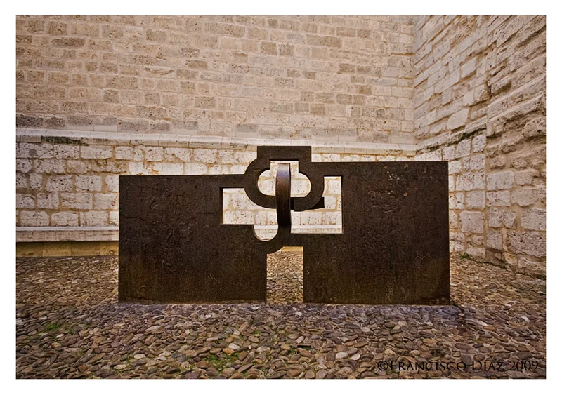
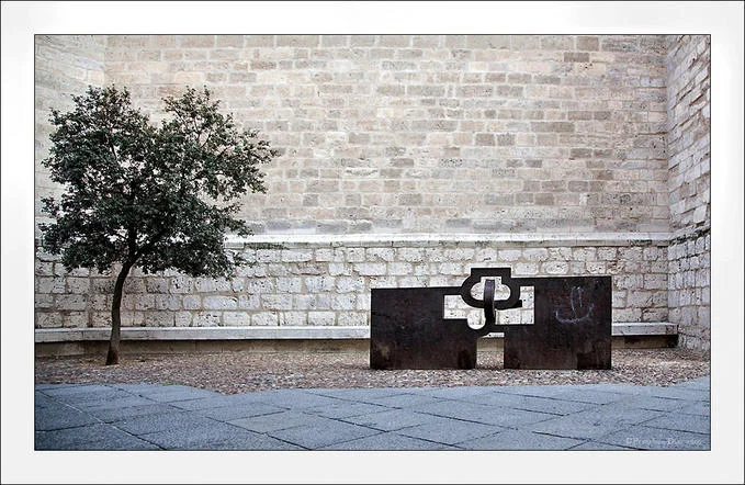
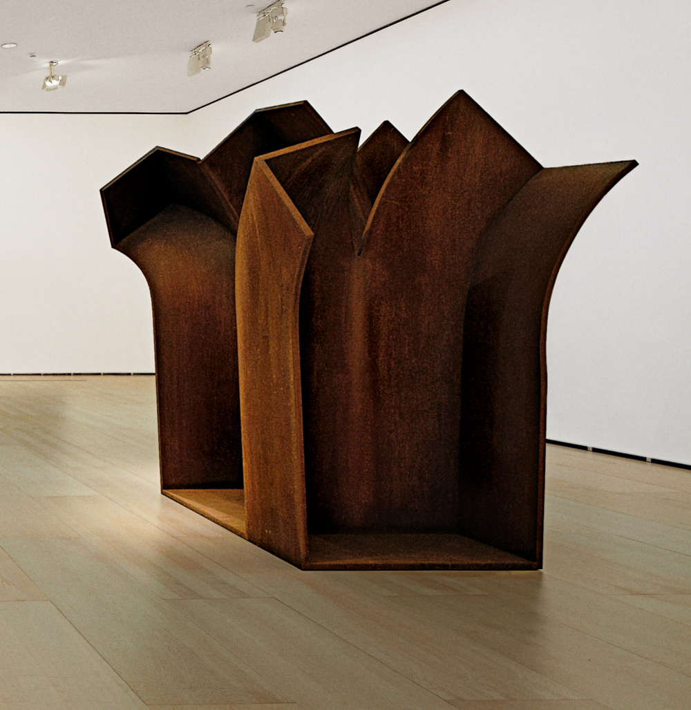
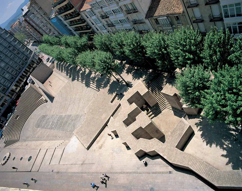
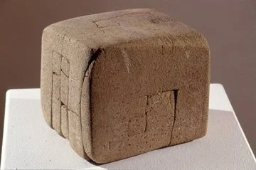
An artist who not only studied art but also architecture, Chillida's most famous and celebrated works are monumental outdoor sculptures made in steel and concrete but he also worked beautifully with so many other materials including alabaster, wood, clay, gypsum, bronze, felt and of course hand made paper. Some of his stone sculptures seem almost primitive yet are so modern it reminds me of advanced intelligence. Think Fifth Element (I love that movie). My favorite among Chillida's works is "The Basque Liberties Plaza", 1980, reinforced concrete and steel. I think that might be because it reminds me of a different time and place - my grand father and his home where I spent much of my childhood. More on that later...but for now, I'm happy just rediscovering this artist whose work I relate to at so many levels and I think a trip to the Basque Country side is very much in order.

I hope you have an inspired Monday morning! - xo Raji

Photos from Flickr and Pinterest
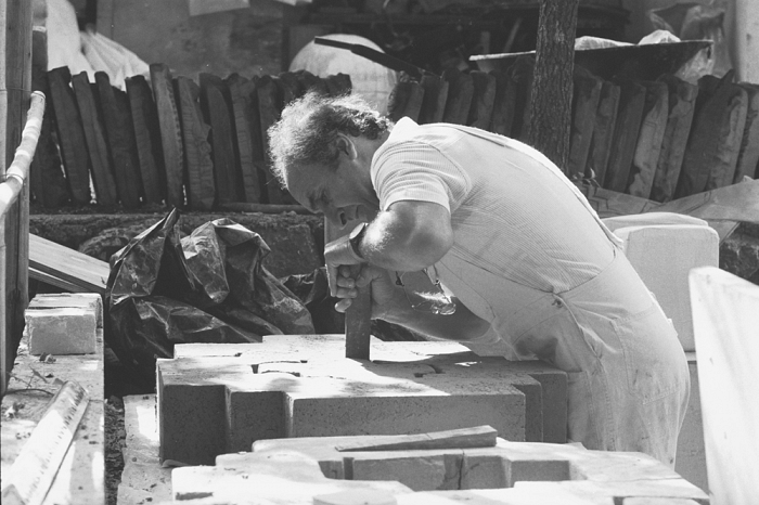
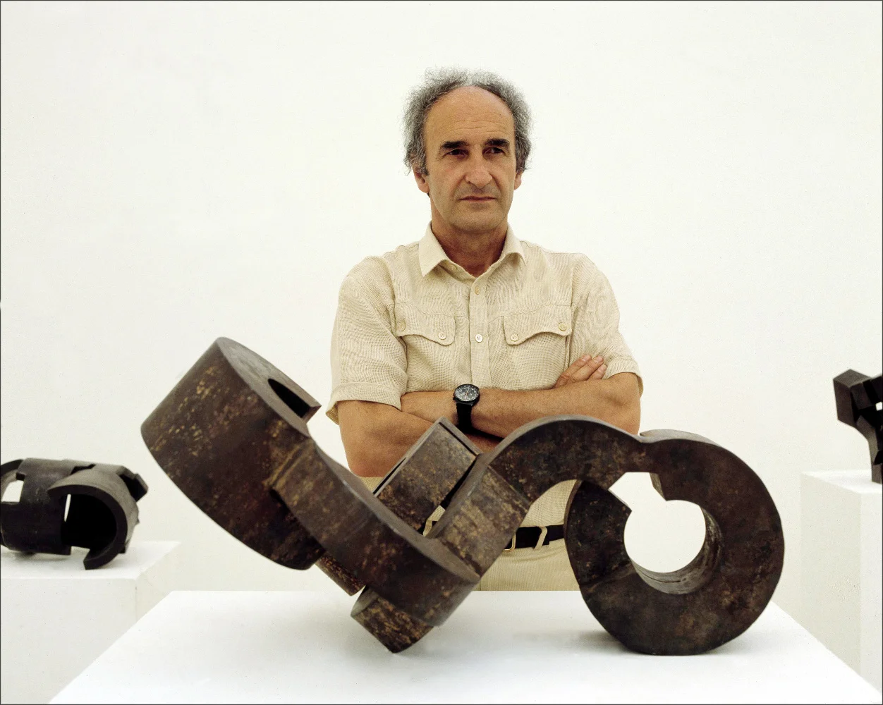
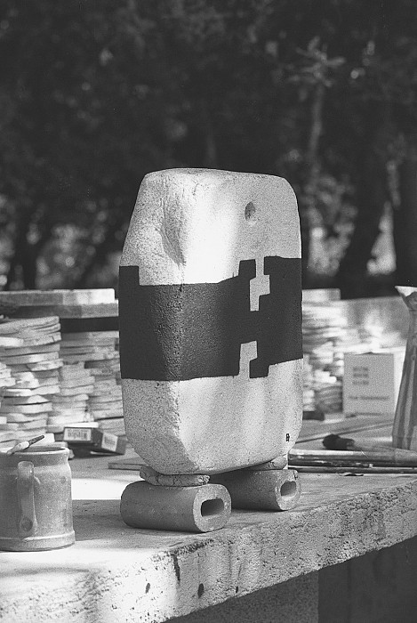
Chillida modeling a clay sculpture in 1973; Photography by Ernst Scheidegger

Chillida modeling a clay sculpture in 1973; Photography by Ernst Scheidegger

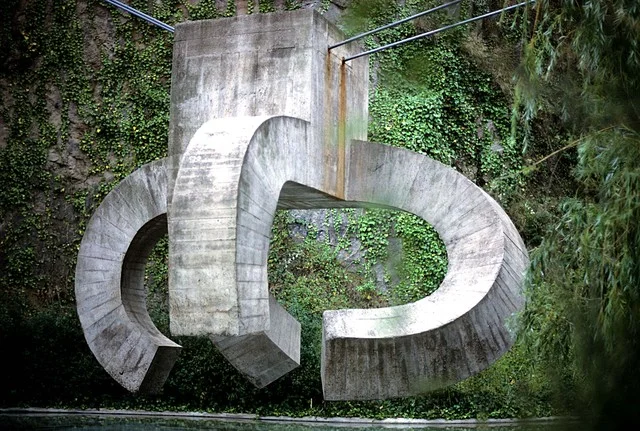
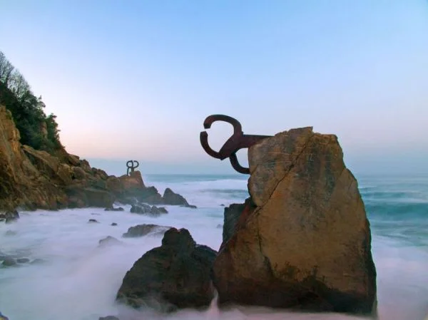
El Peine del Viento (Wind Comb), a public space in San Sebastian

El Peine del Viento (Wind Comb), a public space in San Sebastian

"The Basque Liberties Plaza", 1980, reinforced concrete and steel.

"The Basque Liberties Plaza", 1980, reinforced concrete and steel.

A painted clay sculpture, 1973 - Photography by Ernst Scheidegger

A painted clay sculpture, 1973 - Photography by Ernst Scheidegger

Why Something Small Can Make A Big Difference by Raji Radhakrishnan

Interior by Raji RM & Associates; Photography by Rikki Snyder

Interior by Raji RM & Associates; Photography by Rikki Snyder

I know I often talk about "grand" gestures and yes, in some ways murals have become a signature style in many of my projects. But, if you look closely at the whole room and observe or better yet, if you actually walk into a room I've designed you will notice that while the big gestures draw you in at first, it is several of the small gestures that put a smile on your face and makes you actually want to linger. Designing a room is not about just one grand gesture. I know that because I still design many homes with nary a mural in it. It is the sum of several parts that is much greater as a whole. Sometimes when it does involve a grand gesture like a mural then I think carefully about what it might do to a room's composition, the architecture and how each piece, each move I make interacts with and affects the other parts of the room and in fact the rest of the home. Every piece in the room plays a role, like characters in a play, and make the room come together and come alive. Nothing is trivial. Everything bears consideration.

And when I say smaller parts I mean all the way to the tiniest detail. A good example is my own living room. I devoted nearly an entire wall to Leopold #2 mural seen above. I chose this mural, because the original painting reminds me of Thomas Struth' photographs. I like to think that perhaps Struth was inspired by it to create his Museum series. Besides, every time when I have guests in my living room looking at this mural it is down right exhilarating and funny at the same time. It is as if they and the room together have now become part of a painting/photograph too animating the whole space.  It is also a happy nod to my love of art, museums and people watching!

Detail of a tiny 2" x 3" wire sculpture juxtaposed in the adjacent wall where a large 14' x 8' mural is

Detail of a tiny 2" x 3" wire sculpture juxtaposed in the adjacent wall where a large 14' x 8' mural is

Typically, when guests come into this room, they are taken by this enormous mural for the first few minutes and slowly as they settle down on one of the lounge chairs or sofas they get comfortable and start chatting. I think it is during that time they start noticing all the other pieces and finally some one (often it is a child who does) notices that little, tiny wire sculpture sitting atop the shelf on the wall adjacent to the mural. Some ask what it is and how come I placed such a tiny sculpture next to this large mural and I say it's just a play of scale and a reminder of how tiny we all are in this great, big world. And they smile and the conversation turns to more worldly matters, our children, family, DC politics and I feel like all these little things in the room are all partaking in this lively conversation and are pleasantly happy to be there too.

Raji RM & Associates | Interior Designer & Decorator

Washington DC | New York

Contact us to learn more about our work

Inspired Monday Morning - Anish Kapoor by Raji Radhakrishnan

In a world of mass production, information overload and constant messaging I seem to yearn for the unknown, unseen and often in a way that's unprepared. A core aspect to the work we do here at Raji RM is taking huge risks, within the scope of the project of course. The risks pertain to the untested idea, unseen even by us. Because designers I think are artists at the very basis, pragmatists too, as we define our work within the confines of walls driven by functionality, needs and desires.

It is then only necessary that we voyage as often as possible into the depths of artistry, departing from the every day dictum of practical life and logic, only to come right back with monumental inspiration, chiseling out just a sliver of that learning and deftly applying it to our work in transforming the spaces with meaning and perspective to the discerning eye.

One of the contemporary artists who has never failed to inspire me is Anish Kapoor. The risks he takes in his works are often in the face of adversity with the uninformed and the uninitiated. Yet he pushes each new work to another realm, unexplored or even unidentified, until that perspective is explored through his own works. He plays not just with scale or color but with our minds, our perspectives, our view of ourselves and the world around us. Need I say more...juste ma tasse de thé!

(All photos are from Tumblr & Flickr)

Raji RM & Associates | Interior Designer & Decorator

Washington DC | New York

Contact us to learn more about our work

Inspired Monday Morning: Richard Serra by Raji Radhakrishnan

One of the most prolific artists of the Twentieth and Twenty First Centuries. An artist who understands scale enough to master it, how to play with it and what it does to human emotions. Scale combined with the power of a single note, a single gesture, a single color. Scale combined with form and material. By quiet observation one of my silent mentors. Juste ma tasse de thé!

Image via ArtObserved.com

Image via MOMA

Image via New York Times

Image via CocoBabaGanoush

Image via Art Observed

Raji RM & Associates | Interior Designer & Decorator

Washington DC | New York

Contact us to learn more about our work


Art in Design: Le Petit Defi - as in Bourgeois Lite! by Shruti Narasimhan

Throwback Thursday #TBT - This is a post Raji wrote in late 2009 for design dossier and it still holds good.

Photo from Guggenheim

A few years ago, the Guggenheim had a fantastic retrospective of some of the most important works of Louise Bourgeois. As you climbed the winding ramps filled with displays, Bourgeois' two dimensional works led up to three dimensional installations. Some were really large ones like the 'cell' which inspired the design of one of my bathrooms. Among them, an installation called 'Le Defi' meaning 'the challenge' (see photo at right) - a blue painted wooden shelving with rows of old collected glass ware lit up here and there - caught my eye. I was drawn to it partly because at that time, I had set up a small group of my own glassware in a corner of my bathroom counter with one of them being a little vintage cut-glass lamp placed in the center. And I thought, this is something I should do, after all I already have most of the things used in that installation. And then, I forgot about it. That is until this summer when I started to ponder and plan the 'Foyer & Galleries' for the CharityWorks GreenHouse.

As I mentioned before, I chose to treat much of the narrow spaces I designed for the CharityWorks GreenHouse like an art gallery. So, besides hanging works on the walls, I also planned a few art installations mostly using salvage and re-purposing things. One of them in the upstairs landing is a light installation, my own version of 'Le Defi' which I call 'Bourgeois lite!' (see photo below), an example of inspired art and a relatively 'small challenge' when it is 'after Bourgeois' Le Defi'. Instead of a shelving cart I used a vintage book stand. My collection of vintage glass ware and small glass lamps are grouped in the two shelves of the book stand. A 1940s French swing arm lamp provides task light for the book opened to read and an industrial typist chair from the 1920s by the English Co, Tan Sad gives you a perch to sit at the landing and become part of the installation itself.

Raji RM & Associates | Interior Designer & Decorator

Washington DC | New York

Contact us to learn more about our work