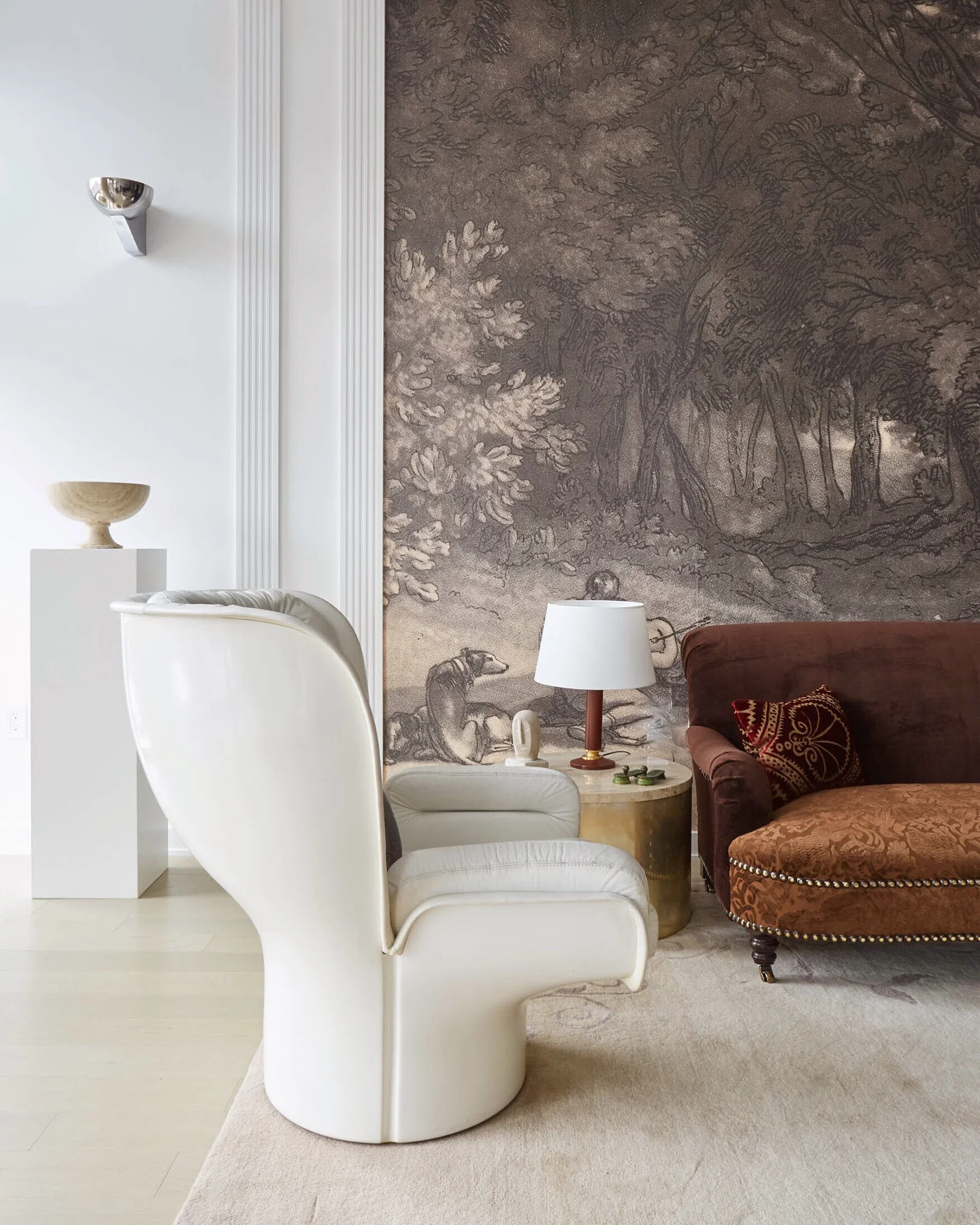
A view of a corner of the living room in an apartment I designed in DC’s West End earlier this year. This was for a dream client with the most genteel demeanor, one who sets the standard as to how clients should be. Saying that designing his apartment was a pleasure would be an understatement. He already loved the mix I do, so that came naturally. But, the catch was, while we both have very classical and modern tastes, the apartment itself is a very contemporary glass and steel kind of place. In addition, what was challenging was the enormous scale of some of the walls in these rooms.
.
Taming them became a priority and a large scale mural alone was not the perfect solution as it would only become more overwhelming. I knew I had to divide and conquer which was the right strategy and the first step to take. So I had the wall divided in three parts with simple, vertical pilaster like moldings before the center area got the mural he loved. What it did was not only tame the largess of the wall to a more human scale, but, by selecting the right type of vertical moldings it also bridged the gap between the very contemporary space and the more classical gestures we both wanted to add. Call it a peaceful and amicable union of two worlds borne almost a century ago from the same principles of architecture and design. 🍂 🍂 🍂 Stay tuned for more views of this room in the next post.
.
#interiordesign by @rajirmdesign
#photography by @rikkisnyder
.
Copyright of Text and Photographs ©️DesignerRajiRm2019 &©️RajiRMdesign2019 - All Rights Reserved.
#rajirmdesign #rajirmrugs #rajirmmurals #interiors #interiordesigner #washingtondc #allinthemix #classicaldesign #moderndesign #contemporaryspace #joecolombochair @georgesmithfurniture #JacquesAdnet

