Inspired Monday Morning: Christophe Côme /
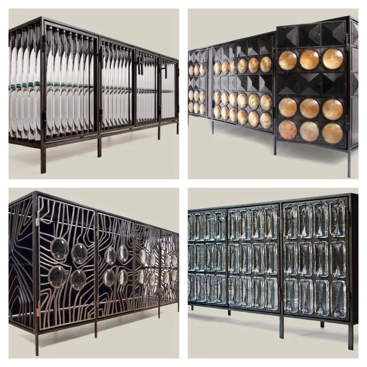
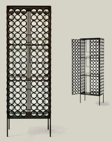
Almost always a truly spectacular piece of furniture is born when unusual forms and materials fuse together perfectly and envelope what is a fundamental base for functionality. That's easier said than done. Unless you are born in an artistic family, raised and taught to be an exceptional craftsman, have the will and the tenacity to explore working with new materials and forms mid-career and in essence if you are Christophe Côme. The French artist and furniture designer creates furniture that are really sculpture portrayed in the form of furniture. His most unusual furniture pieces invariably steal the show even in a room filled only with the finest of furniture and art. I should know as I showcased one of his cabinets in the 2011 Hampton Designer Show House and where every person who walked into the room had to ask about this cabinet and who it was by. The facets and dimensions that the glass pieces create is pure magic and it is all due to the clever shapes, placement and encasement within finely sculpted steel that is Côme's signature style.
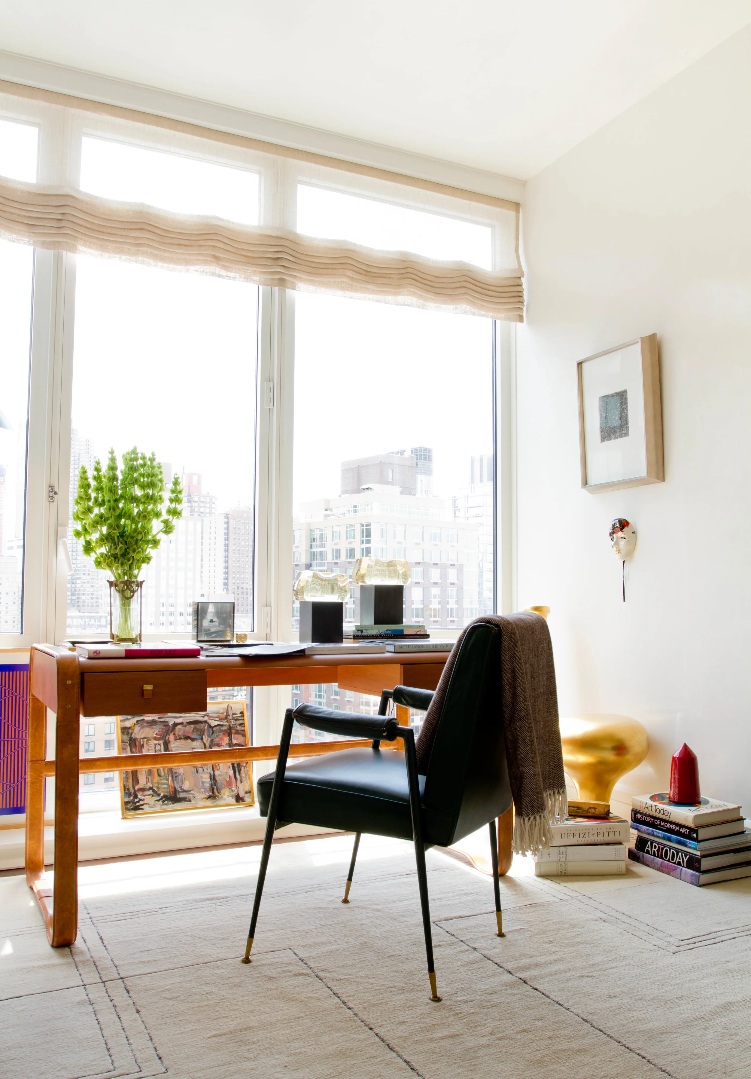
His Loukoum lamps are another favorite of mine. Like an ice block glowing from within. A simple idea but executed in the most beautiful way acting like jewelry in a room. Even in a room with my large murals and exceptional vintage furniture, his lamps quietly made people gravitate towards the desk where I placed a pair of these lamps on it. As odd as it may sound, being in the company of great pieces like this does certainly feel like you've been whisked away (think Woody Allen's Midnight in Paris) to a time and place where the intellectuals and the artists met, discussing fervently the most important issues of our time. The dialogue and interaction that each have with the other then become of utmost importance but it all starts with the integrity, craftsmanship and style of each piece and that in turn starts with the kind of person, the artist who created them in the first place. And for that reason and beyond, Côme won my heart a long time ago...
xo, Raji
2011 Hampton Designer Show House Designed by Raji RM featuring a Christophe Côme cabinet
Press: Thank you Washingtonian! /
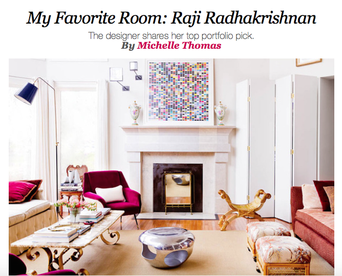
Check out Raji's favorite room from her portfolio featured in Washingtonian! Click here to see why the room is a favorite!
Press: We made the LUXE Magazine 2015 Gold List! /
We are thrilled and honored we made the LUXE magazine 2015 Gold List! Thanks to editor-in-chief Pamela Jacarino. Check out their full list in their winter issue!
Inspired Monday Morning: Christian Astuguevieille /
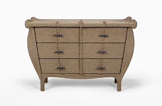
Has this ever happened to you? You come across a material or color that you fall in love so much that you want to cover every object or surface you possibly can with it? Or you start with one and you love it so much that you continue looking around for other objects or surface you can cover it with?! And I wonder if that's how it started for Christian Astuguevielle and his rope furniture. Surely, it's far more deeper, well thought out et raisonné. When I first came across Astuguevielle's rope furniture in early 2000s, I thought they were absolutely incredible, sculptural, very impractical and loved them!
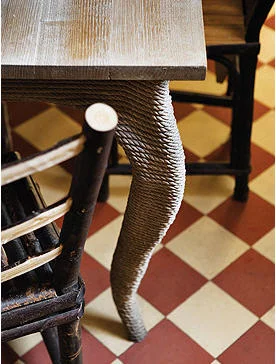
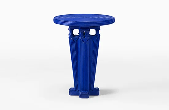
Over the years as I have explored objects searching for the unusual, the difficult, sometimes unseen and unheard of, I came across many interesting rope clad works including lighting by the likes of Adrien Audoux and Frida Minet. But, I have grown to love furniture covered in this age old, rough, pliable material that requires acute precision and the eye of an artist to create a truly beautiful object more passionately than any other material and now have immense respect for Astuguevielle's work. His ability to take a mundane object and create a sculptural presence once he encases them in cotton cord, twined fiber or hemp, is pure genius. So what if they are sometimes robbed of their daily use especially when they are imbued with such a tactile quality, begging you to touch the stiffened ropes and feel the knuckled knots all while they take on a persona far more interesting and potent than most other objects in a space.
And what less can you expect of a man who has been the artistic director of fashion houses like Nina Ricci, Rochas and Hermès as well as the nose behind the fragrances produced by the Japanese design house Comme des Garçons. Well groomed and seasoned, enriched and exposed, Astuguevielle's work is the embodiment of knowledge and refinement that transcends the ordinary to extraordinary. Sublime et tout ma tasse de thé!
- xo Raji
Images of Astuguevielle's Paris apartment via Elle Decor (Espana)
Images of Astuguevielle's furniture via Holly Hunt
Happy Holidays! /
Wishing everyone warm, heartening conversations and love you will remember forever! Happy Happy Holidays!!
- xo Raji
Kalorama Project - Sneak Peak! /
A few months ago I started on a project for a client whose daughter lives in New York and knew my work. When her mother bought an apartment in the lovely neighborhood of Kalorama in Washington DC, it was she who suggested to her mother that she call me. This is a contemporary apartment of a world traveler who has collected art over the years from around the globe. The client is a smart, sophisticated and caring person and I am very happy to have met her. Her apartment needed to suit her needs, her dreams. The goal was to create a sophisticated home with furnishings that worked well with the contemporary architecture and form a fine backdrop for her collection of global antiquities and modern art. For me, it was very important that the design & art meld and complement one another in a seamless fashion - one should pick up where the other left off. I also decided that because the art was significant and high in personality, the design needed to be fairly quiet and in keeping with the modern nature of the architecture. This meant that mixing traditional pieces with modern and contemporary furniture needed to be kept to a minimum.
In my own home (which is an amalgamation of Georgian and modern architecture) I have mixed a lot of contemporary, modern and traditional pieces together but I've always believed that the extent to which one can mix styles in furnishings has a lot to do with the architecture of the space and the inherent tastes or collections of the clients. This one is through and through a contemporary apartment. However, the client's collection of art ranges from modern art to 17th - 18th century Indian, Mexican, Japanese and Javanese sculptures. How do you bridge the gap? If I had added traditional furnishings it would not only be against the grain of the architecture but also very confusing and clashing with too many stories floating around. Thus, the key was to offer restraint and transition the antiquities gently into the modern world. Connect the dots, fill in for gaps in a sensible way. I thought of Christopher Columbus and I imagined taking a new route today starting in Asia, passing through Western Europe and eventually landing in America. The lynchpin being Western Europe, the missing part of the puzzle. As it happens the client expressed great interest in my murals. But I couldn't use just any mural. So the search began for European art that could work as a beautiful mural and backdrop for the antiquities while poised perfectly against the contemporary background. And it wasn't just the murals. The plan called for a slightly minimalist approach. That meant every piece of furniture had to have a reason for existence. Not just functionally but in the story I was weaving. French and Scandinavian modernist furnishings helped with that. Aesthetically, the design still needed some semblance of the old interpreted in a contemporary way and I couldn't think of better materials than brass and bronze which age beautifully and have that warm glow - this time in the form of modern tables and lamps.
As we completed the installation, I thought of my client and imagined her family gathering around for the holidays, talking about their own stories and I smiled as I bid adieu to my team and hurried back home...
Wishing you and yours a Warm & Happy Holidays!
- xo Raji
p.s. photos of the completed project coming soon!
All photos via our Instagram posts.
Online Press: Thank you Houzz! /
Baby, it's cold out there! Time to cozy up for this winter. But first, check out this Houzz story on stocking up on the essentials and some goodies to chase away the blues and make the best of hibernating days. And thanks to Houzz for featuring our work to make a point - "piles of books provide an open invitation to toss out your plans and read all afternoon in the snug house instead." We couldn't have said it better!
Design by Raji RM
Online Press: Thank you Houzz! /
Check out Laura Gaskill's fabulous article on Houzz (which includes our work) on pairing round dining tables with complementary but different style chairs!
Happy Thanksgiving! /
Wishing you a Warm and Happy Thanksgiving break with all your loved ones!
- xo, Raji
Raji RM Interiors


